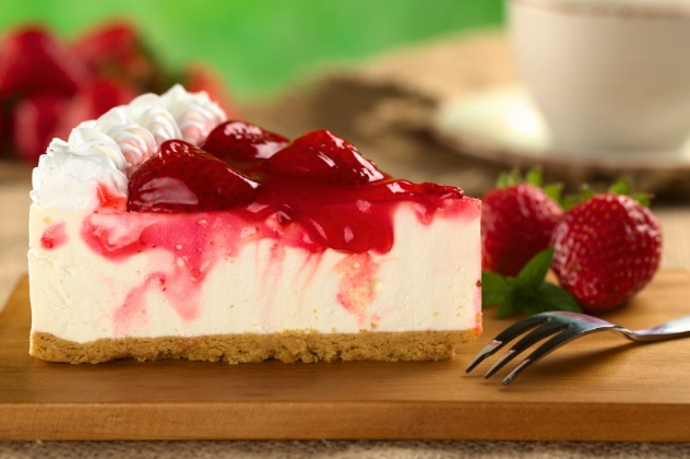
The Cheesecake Factory. What comes to mind first when you hear that name? If you thought “cheesecake”, I completely understand where you’re coming from, but what I think of first is “options”. After a recent meal at Boulder’s local Cheesecake Factory, it really struck me just how many choices are on the menu. Covering everything from Mexican to Italian, with appetizers, entrees, and desserts in each cuisine, the menu is formidable. There are more than 250 items!
This experience spurred me to investigate the psychology of menu design, and how parallels in menu design can be drawn to digital marketing.
Nobody Puts Baby in a Corner
It appears there is some serious debate as to how people scan a restaurant menu. Some folks say we scan in a “Z” pattern, some say we scan sequentially like reading a book, and still others say we focus first in the middle and then to a corner. There isn’t universal agreement between all these views, but a recurring theme is the high degree of emphasis placed on the corners. On a menu, you’re likely to find the highest margin and most expensive items placed in the corners. That way people are more likely to give the $40 steak meaningful consideration.
On the digital marketing side of things, it’s common to place a company’s logo in the top left, and important calls to action in the top right. Common elements to find in the top right include shopping carts, free trial offers, or a customer login. Whether it’s a web page or a menu, people can be expected to pay extra attention to content in the corners. Consider the corners of your web pages prime real estate, and experiment with placing high-value content there. Personally, I believe people pay extra attention to corners because there is comfort in identifying the boundaries of what you’re looking at. Understanding where one set of information ends and the next begins.
Too Many Chefs in the Kitchen...
There is more uniformity amongst opinions about the optimal number of choices that should be on a restaurant menu. The general consensus is that about 7 appetizer/desert options and about 10 entrées will ensure the menu isn’t too overwhelming, but still provides an adequate number of choices. Why is limiting the number of options important? To avoid choice overload.
Choice overload impedes the consumer’s decision-making process and leads to sub-optimal decisions and choice deferral. Being presented with numerous options can be appealing at first, but ultimately makes it more difficult to effectively evaluate each option and settle on one. In the restaurant world, a customer is likely to fall back on ordering something familiar and basic rather than an extravagant signature item when presented with too many choices. In digital marketing, choice overload is likely to cause a visitor to defer making a decision, and bounce from your website.
Avoiding choice overload is a nuanced exercise and your business model must be taken into account when determining what’s going to leave your customers with the right number of options. For example, The Cheesecake Factory defies conventional menu wisdom when it comes to size. But, it’s fair to assume their menu has become an integral component of their brand identity and ultimately helps drive their success.
A Technicolor Dream Menu
Another element integral to any menu worth its weight in salt is the color scheme. Color plays an instrumental role in menu design and no color makes its way into the final draft by accident. Over time people have developed automatic subconscious reactions to colors, and so plenty of thought goes into what feelings can be evoked by specific colors, what these colors say about a brand, and how colors subtly influence a reader's perceptions.
The influences of color are mostly subconscious, and so understanding context is key to using them right. Certain colors like blue and purple are used widely outside of the restaurant context with great success. Blue is typically associated with trust and stability, and functions well for organizations like insurance companies or banks, where those characteristics are highly valued. Purple is commonly affiliated with qualities of decadence and regality, and so many luxury brands incorporate purple into their color schemes.
But blue and purple mean something quite different in the restaurant business. Blue and purple foods are fairly rare in nature, and if you do happen to come across blue or purple food, chances are it has spoiled. While blue and purple carry positive connotations in most situations, the sentiment doesn’t carry over to the restaurant world where these colors might signify something is dangerous to eat. You’re more likely to see green, orange, and other appetizing colors in a restaurant's color scheme.
Bon Appétit
Our decisions are constantly informed by a multitude of factors we aren’t fully aware of. By understanding just a few, marketers and restaurateurs alike can subtly influence the decision-making process, and stack the deck in their favor.
About Author
themarketelement
Stay up to date.
Subscribe for periodic updates on the latest happenings in life science and healthcare marketing.
Subscribe Here!
Related Posts
Ingenuity is about being clever, original, and inventive. It means finding a way to accomplish your goals
BY Andrew Sober
The opinions expressed in this blog post are not legal ...
BY Andrew Sober
Paid advertising is the most immediate lever you can pu...

Comments